Fluid Typography with CSS Clamp: A Complete Guide
Jordan Lee
Senior Frontend Developer
The Problem with Breakpoint-Based Typography
Traditional responsive typography relies on media queries:
h1 {
  font-size: 2rem;
}

@media (min-width: 768px) {
  h1 {
    font-size: 3rem;
  }
}

@media (min-width: 1024px) {
  h1 {
    font-size: 4rem;
  }
}
This creates jarring jumps between breakpoints and requires maintaining multiple declarations.
Enter CSS Clamp()
The clamp() function accepts three values:
clamp(minimum, preferred, maximum)For fluid typography:
h1 {
  font-size: clamp(2rem, 5vw + 1rem, 4rem);
}
This creates smooth, continuous scaling between your minimum and maximum values.
How It Works
- Minimum (2rem): The font will never go below 32px
- Preferred (5vw + 1rem): Scales with viewport width
- Maximum (4rem): Caps at 64px on large screens
Building a Complete Type Scale
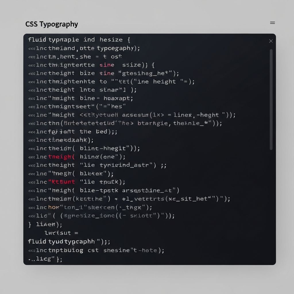
Here's a production-ready fluid type scale:
:root {
  --step--2: clamp(0.69rem, 0.66rem + 0.18vw, 0.8rem);
  --step--1: clamp(0.83rem, 0.78rem + 0.29vw, 1rem);
  --step-0: clamp(1rem, 0.91rem + 0.43vw, 1.25rem);
  --step-1: clamp(1.2rem, 1.07rem + 0.63vw, 1.56rem);
  --step-2: clamp(1.44rem, 1.26rem + 0.89vw, 1.95rem);
  --step-3: clamp(1.73rem, 1.48rem + 1.24vw, 2.44rem);
  --step-4: clamp(2.07rem, 1.73rem + 1.7vw, 3.05rem);
  --step-5: clamp(2.49rem, 2.03rem + 2.31vw, 3.82rem);
}
Accessibility Considerations
Fluid typography respects user preferences when combined with relative units:
html {
  font-size: 100%; /* Respects browser settings */
}

body {
  font-size: clamp(1rem, 0.9rem + 0.5vw, 1.25rem);
}
Conclusion
CSS clamp() eliminates the need for typography media queries while providing a smoother, more elegant scaling experience. Combined with CSS custom properties, it's the foundation of modern responsive typography.
Stay in the loop
Get the latest on typography, design systems, and web development.
Written by
Jordan Lee
Senior Frontend Developer
Jordan specializes in modern CSS techniques and performance optimization. She contributes to several open-source projects and speaks at web development conferences.
Continue Reading
More from the Development category
